A True Work Of Art
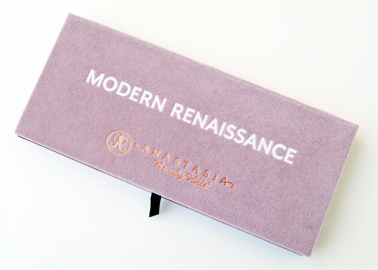
I’m fearful for my other shadows because I can’t seem to put this palette down. I’m talking about the Anastasia Beverly Hills Modern Renaissance Palette (14 x 0.02 oz/$42.00) (Insert heart eyes emoji here.)
The shades are absolutely beautiful and make reference to the Renaissance art period. ABH named the shades after different techniques, pigments, and paintings of the era. As someone who works in the arts and is a beauty addict, I just had to have it. I’m happy to report it’s worth every penny.
There are 14 shades including neutral and berry tones. And because I’m a total art nerd, I thought it would be fun to include a few art facts along with the shades.
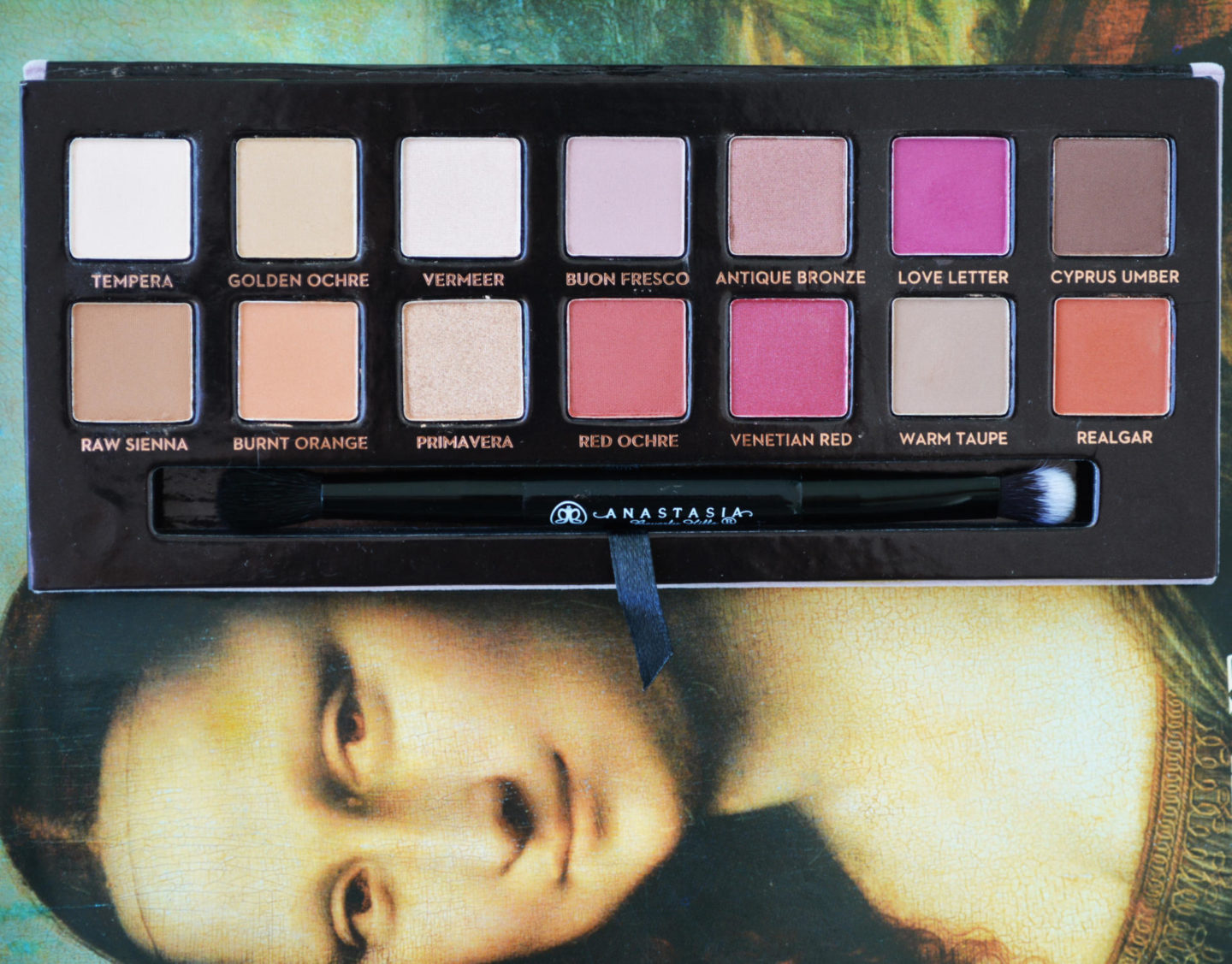 Top Row
- Tempera – Velvety beige, matte finish.
The main method of painting throughout the early renaissance.
- Golden Ochre – Earthy yellow, matte finish.
A commonly used pigment for painting walls in Ancient Roman towns.
- Vermeer – Iridescent shell, metallic finish.
Named after Dutch Painter Johannes Vermeer.
- Buon Fresco – Antique lavender, matte finish.
Italian for True Fresco, this is the most durable method of painting murals.
- Antique Bronze – Metallic sable, satin finish.
Bronze is the most popular metal for cast metal sculptures.
- Love Letter – Raspberry, matte finish.
Named after the painting The Love Letter, 1666 by Johannes Vermeer
- Cyprus Umber – Dark coffee, matte finish.
A dark brown pigment used in tempera, oil and watercolor mediums.
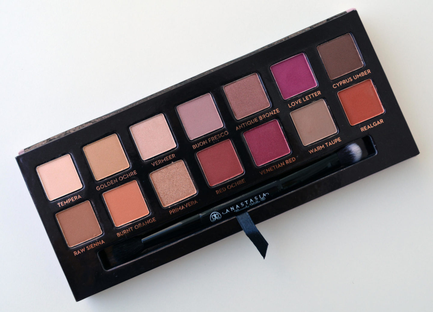 Bottom Row
- Realgar – Brick, matte finish.
A bright rich pigment used in painting during the Renaissance era.
- Warm Taupe – Earthy gray, matte finish.
A neutral brownish gray color.
- Venetian Red – Crimson, matte finish.
A red earth color often used in Italian Renaissance Paintings.
- Red Ochre – Sienna, matte finish.
Renaissance painters used it for fresco, tempera and oil painting
- Primavera – shimmery gold, metallic finish.
Primavera or Allegory of Spring by Sandro Botticelli.
- Burnt Orange – deep orange, matte finish.
A reddish orange color common in many gowns from the era.
- Raw Sienna– neutral amber, matte finish.
A yellowish-brown in color used as a pigment in painting.
Overall Thoughts
The palette comes in a pretty mauve pink velvet packaging. Unfortunately, it’s only a matter of time before I get stains all over it. It also comes with a dual-sided brush. Anastasia did a fabulous job curating this palette. The shades are buttery soft, blend beautifully and they’re highly pigmented.
It’s hard to find the perfect pre-made palette, many palettes come with shades I’ll never use. However, that’s not the case with Modern Renaissance, I love how the colors work so well together. There are no throwaway shades here. The shadows are a bit powdery yet I don’t experience a lot of fall out, which is surprising. It’s hard to pick a favorite shade because I love them all, but my most used are Tempera, Realgar, Cyprus Umber, Antique Bronze and Venetian Red.
I adore and wholeheartedly recommend the ABH Modern Renaissance Palette. It’s a masterpiece!